Project Background
About Mistatim Creative Processing & Amanda
Mistatim Creative Processing, led by Amanda, offers Indigenized Art Therapy that integrates Indigenous culture, teachings, and art mediums. Her approach provides a caring, loving experience rooted in culture and ancestors, creating a space where her clients feel comfortable, can explore, and grow. Amanda’s core values include confidentiality, leadership, wisdom, adaptability, and caring.
Her ideal clients are Indigenous women affected by the 60’s scoop who need personal time to move through a hard time that allows them feel connected, engaged, and heard. Clients choose Mistatim Creative Processing for Amanda's caring approach that is deeply rooted in culture and ancestors. She helps them by using art therapy that combine the creative process and psychotherapy to facilitate self-exploration and understanding.
Mistatim Creative Processing’s positioning statement: "Mistatim Creative Processing provides individuals and groups with Indigenized Art Therapy. We provide a comfortable space, guiding with tools such as art, and help clients to feel confident to work on their healing journey."
Needs & Vision
Amanda's vision for Mistatim Creative Processing was to create a brand that is caring and loving, helping her audience feel connected, engaged, and heard. Her focus was to directly connect with her ideal audience, rather than appealing to a wider audience, avoiding strong associations with 'therapy' and 'counseling' to overcome any potential stigma her clients may have.
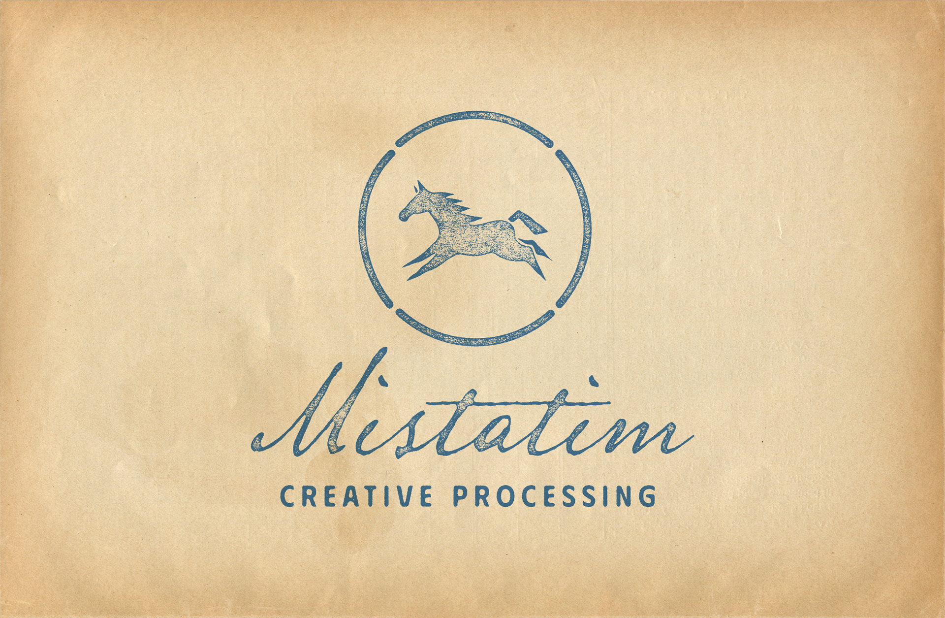
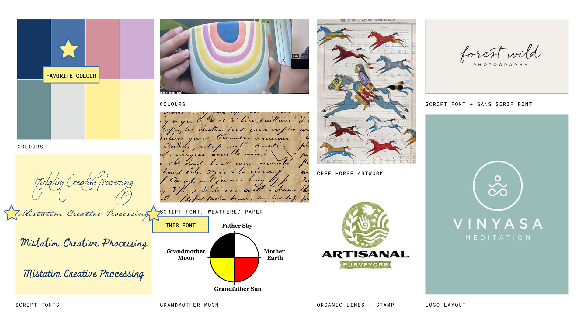
For the design, Amanda envisioned a colourful brand inspired by one of her plant pots. The Cree Horse, symbolizing "Mistatim" (horse in Cree), was chosen as the main symbol. She preferred a script font within a circular shape, with a weathered, tea-soaked paper look. Amanda was open to incorporating other Indigenous references as well.
For her website, Amanda wanted it to be easy to use and maintain, visually appealing with a colourful design that avoided a white background. The website needed to clearly describe the work she did, provide contact information, and educate potential clients. Ultimately, it was intended to help her attract and retain business.
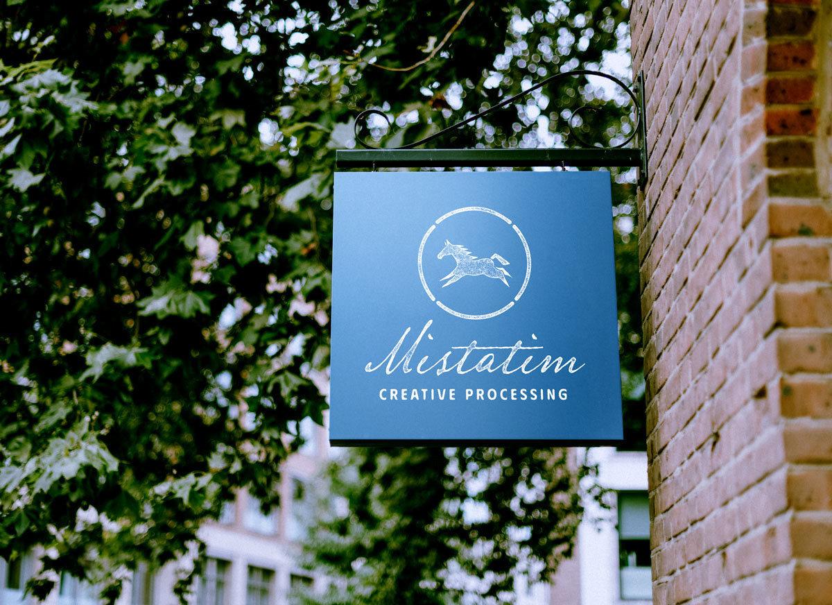
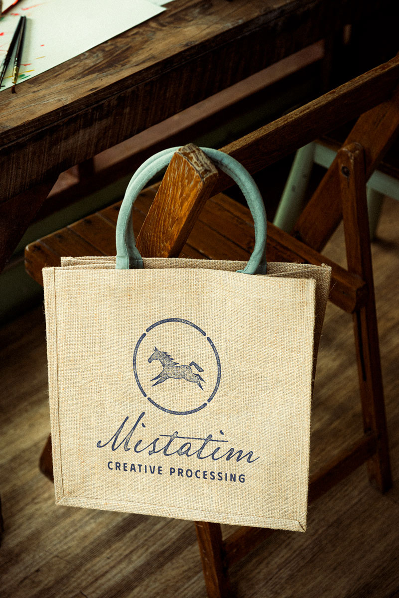
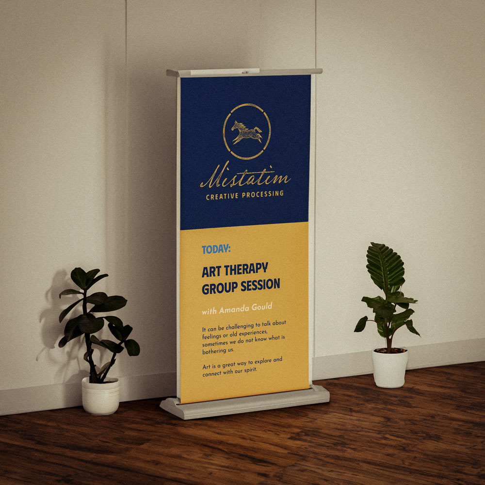
The Results: Branding

The Results: Website
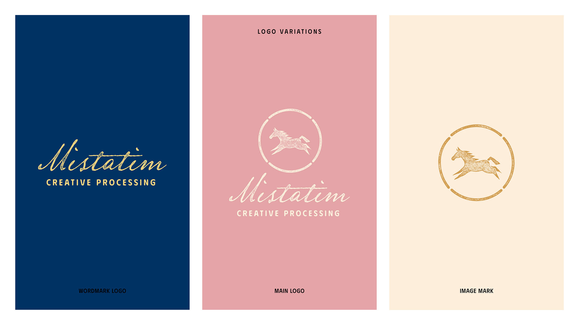
The Solution: Logo & Branding
Getting to learn more about Amanda and why she loves helping her clients is one of the main reasons I love what I do. Hearing the story and 'why' behind someone's mission in life is something I treasure deeply.
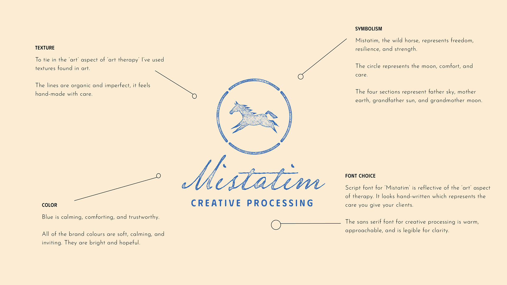
During our conversations, Amanda shared aspects of her culture, particularly about Mother Earth, Father Sky, Grandmother Moon, and Grandfather Sun. Inspired by this, I discovered a four-sectioned symbol representing these elements and more, which I integrated into her logo. This addition brought in her cultural heritage and tied in the circle element she wanted.
To reflect the 'art' aspect of her work, I used textures commonly found in art, incorporating organic and imperfect lines to convey a feeling of care and a crafted experience. The colours from her plant pot inspired an earthy palette, ensuring legibility and contrast while remaining bright and cheerful for use in various formats.
Logo Design
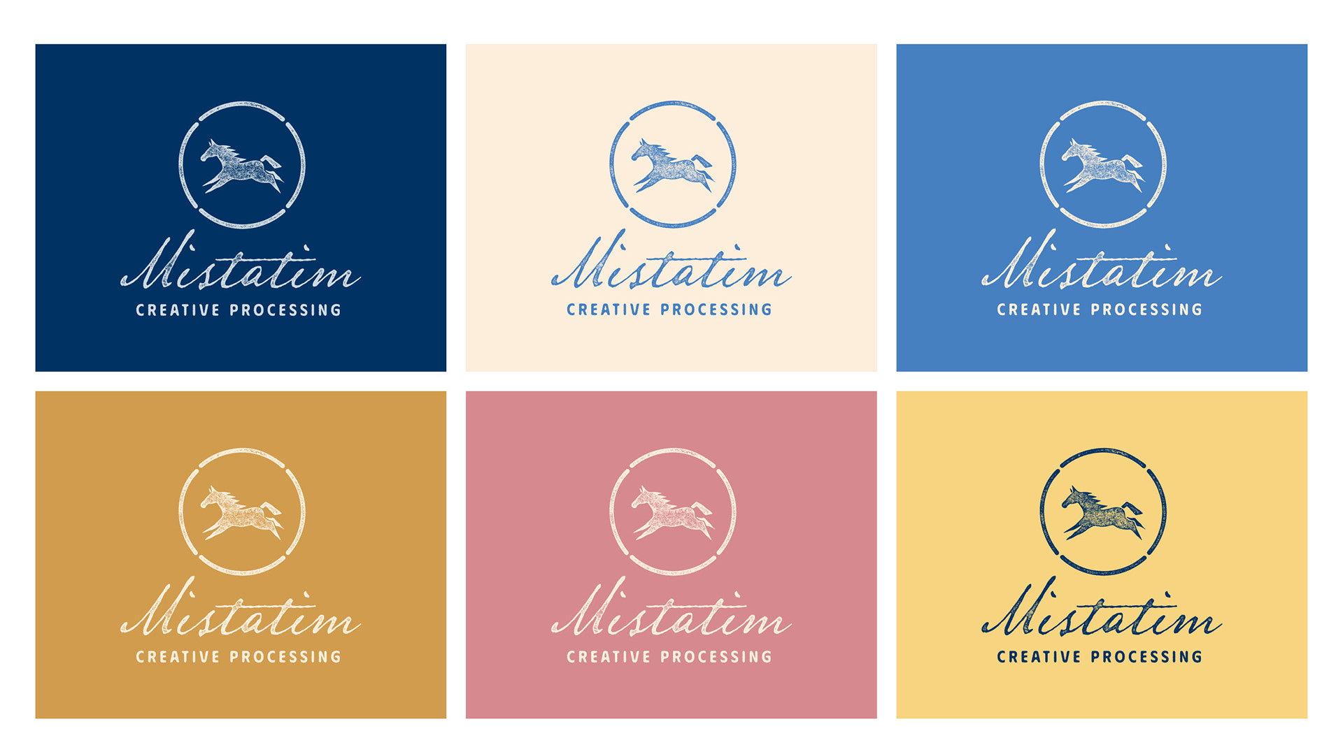
Branding - Colours
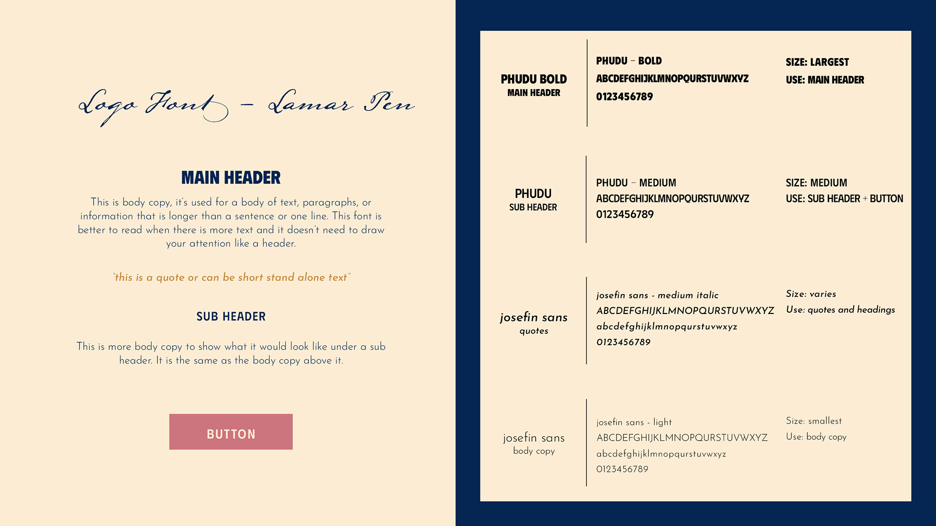
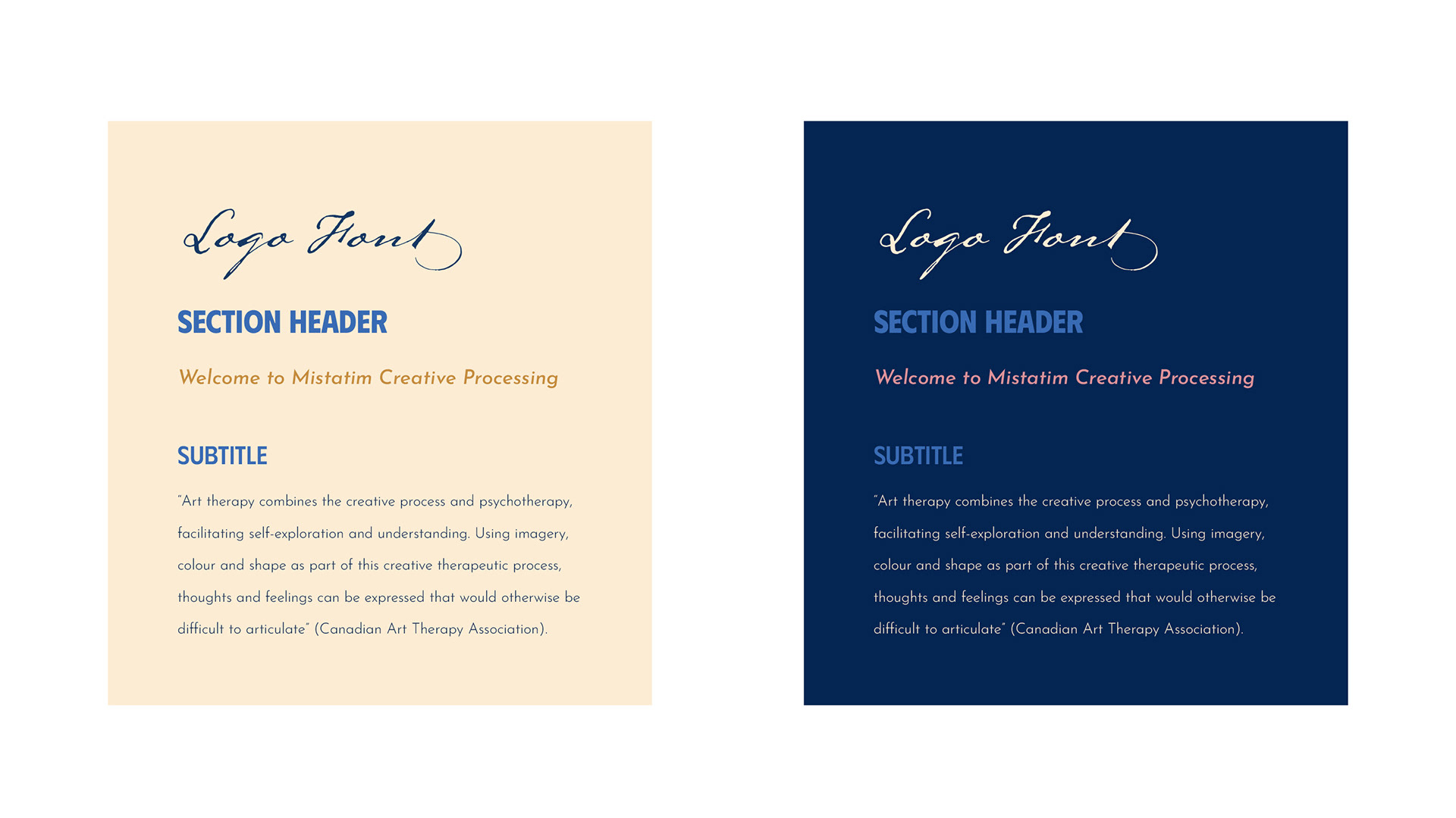
Branding - Typography
The Inspiration
The Solution: Website Design
The website for Mistatim Creative Processing was designed to be user-friendly and create a warm and inviting experience.
The layout is easy to navigate, with clear sections describing Amanda’s services, the benefits of Indigenized Art Therapy, and educational content for potential clients. The website is easy to maintain, allowing Amanda to update content effortlessly. Key information, such as contact details and service descriptions, is prominently displayed for easy access.
The design includes cultural elements to provide a sense of connection and authenticity. Overall, the website serves as a welcoming, engaging space that supports Amanda's mission to attract and retain clients through caring and culturally rooted therapy services.

