Project Background
About RAD Brewing Company
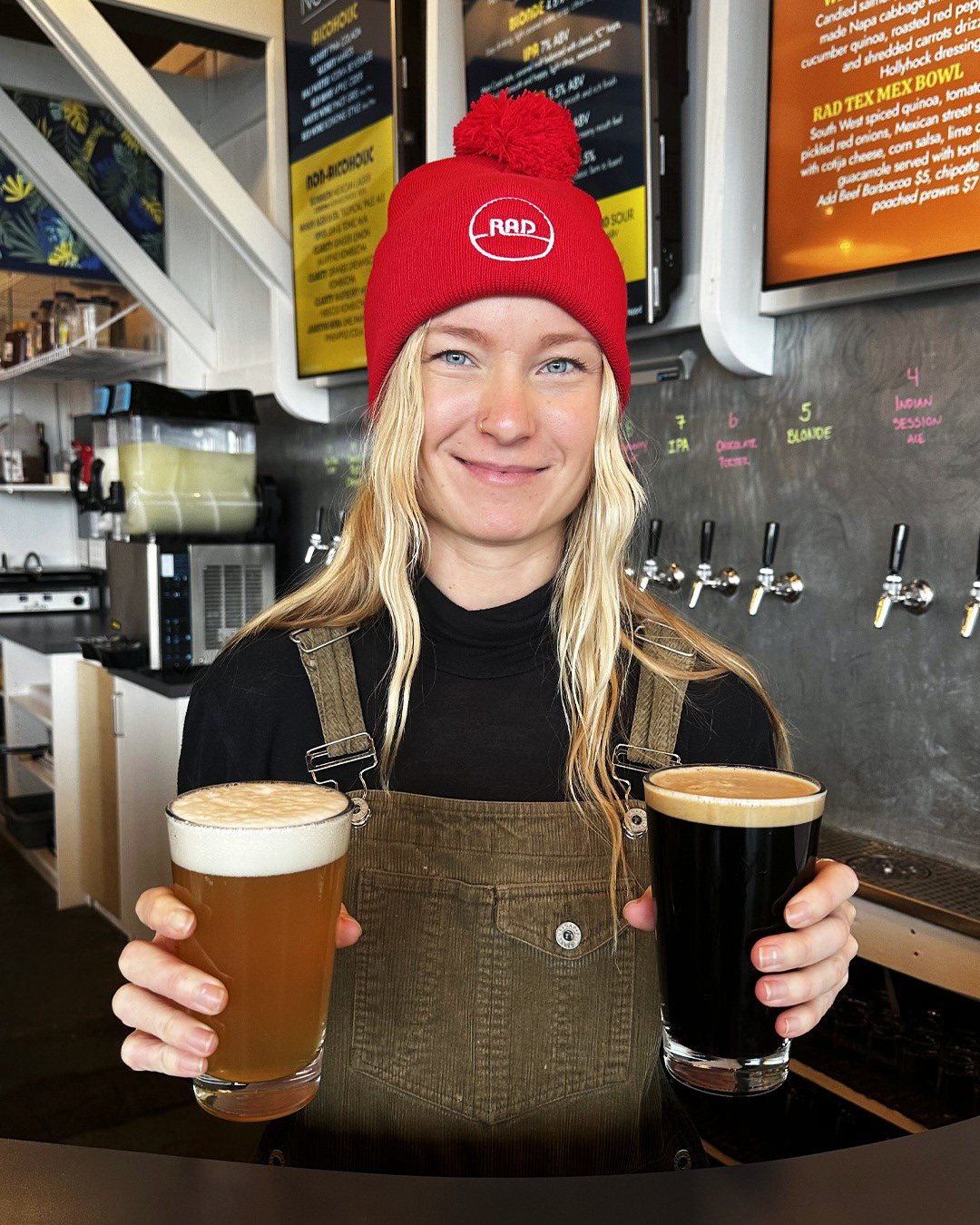
RAD Brewing Company, located in Comox Valley, is a craft brewery that caters to locals aged 25-50 who seek a welcoming and intimate place to enjoy locally brewed craft beer. Valuing community, fun, and inclusivity, RAD Brewing provides a laid-back, approachable atmosphere. They pride themselves on offering locals a brewery with craft beer, excellent food, and a fun, relaxed environment that fosters community and local pride.
Needs & Vision
The project began with RAD Brewing Company seeking branding & a website to establish their identity and online presence for their summer 2023 launch.
They envisioned a brand that is simple, bold, playful, and easy-going, with a subtle nod to beach culture. Their vision was to create a flexible and evolving brand identity that captures the essence of a beachy, relaxed vibe without being overly literal, ensuring the design remains approachable and appealing to the local community.
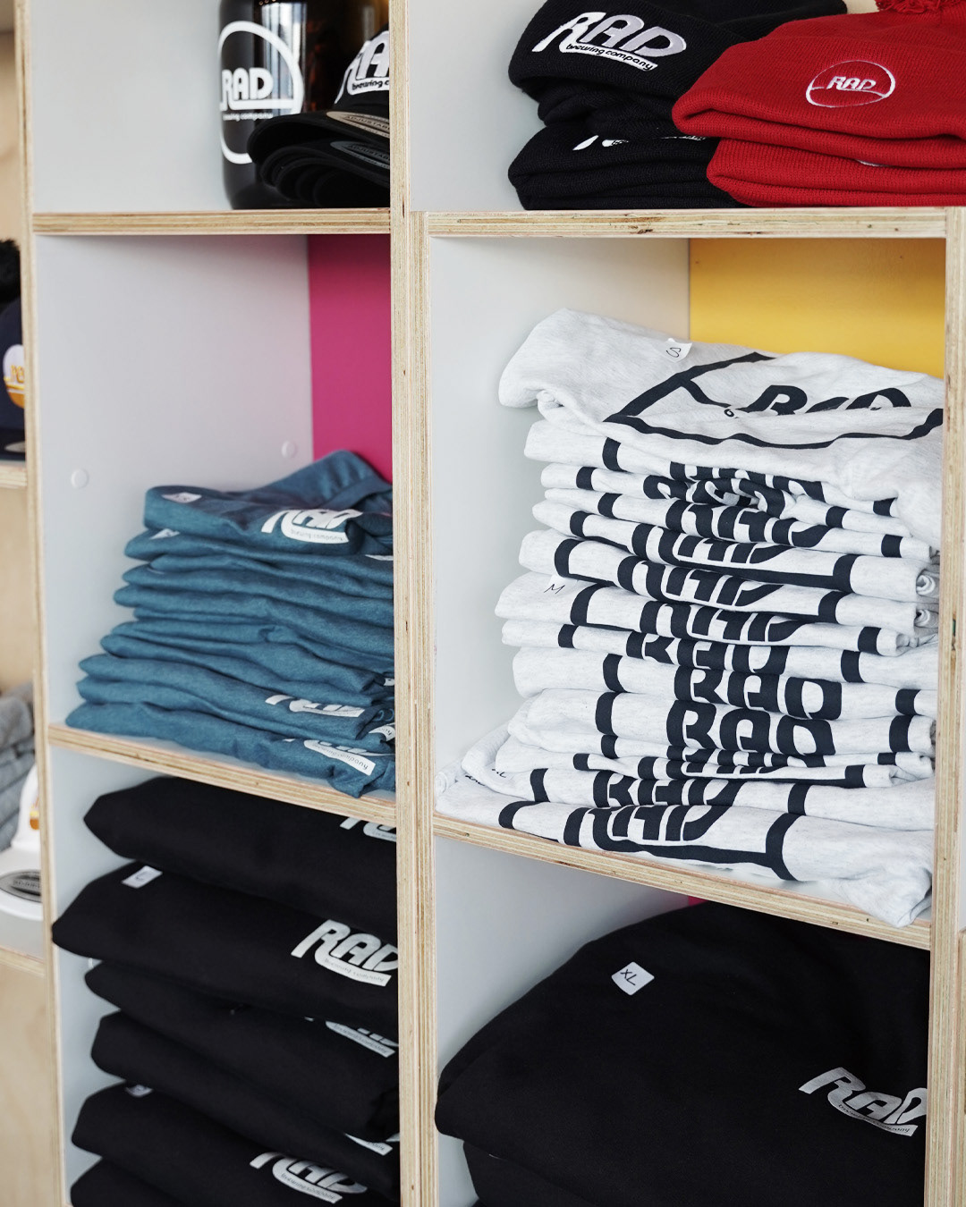
As their business has grown, I have continued to help them with a variety of additional design projects, such as can and merchandise design.
The Result
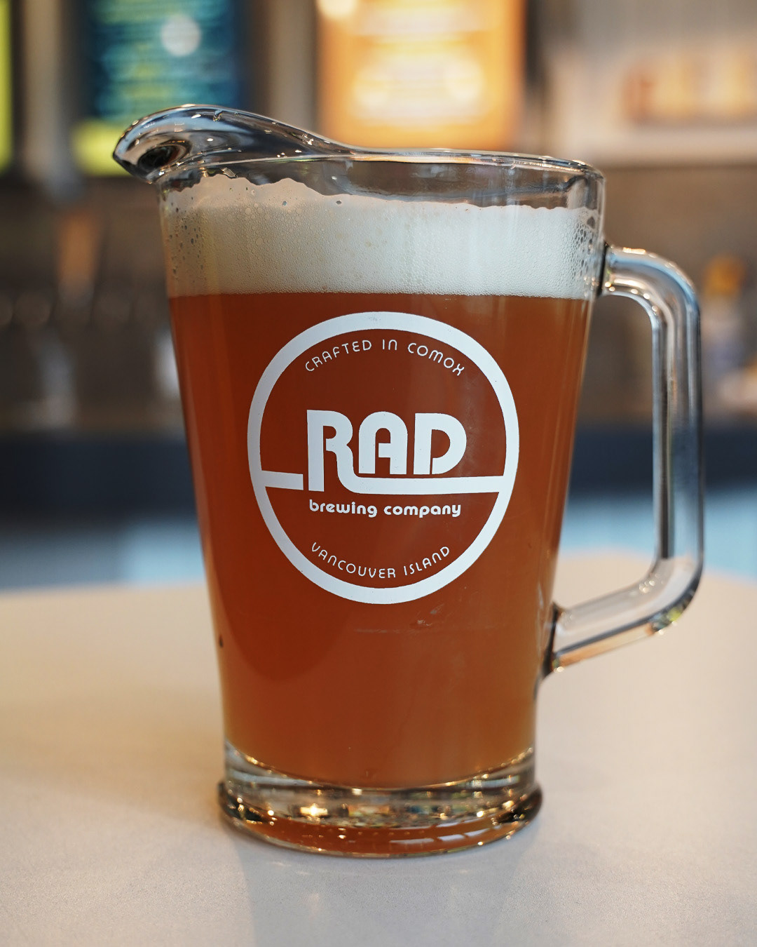
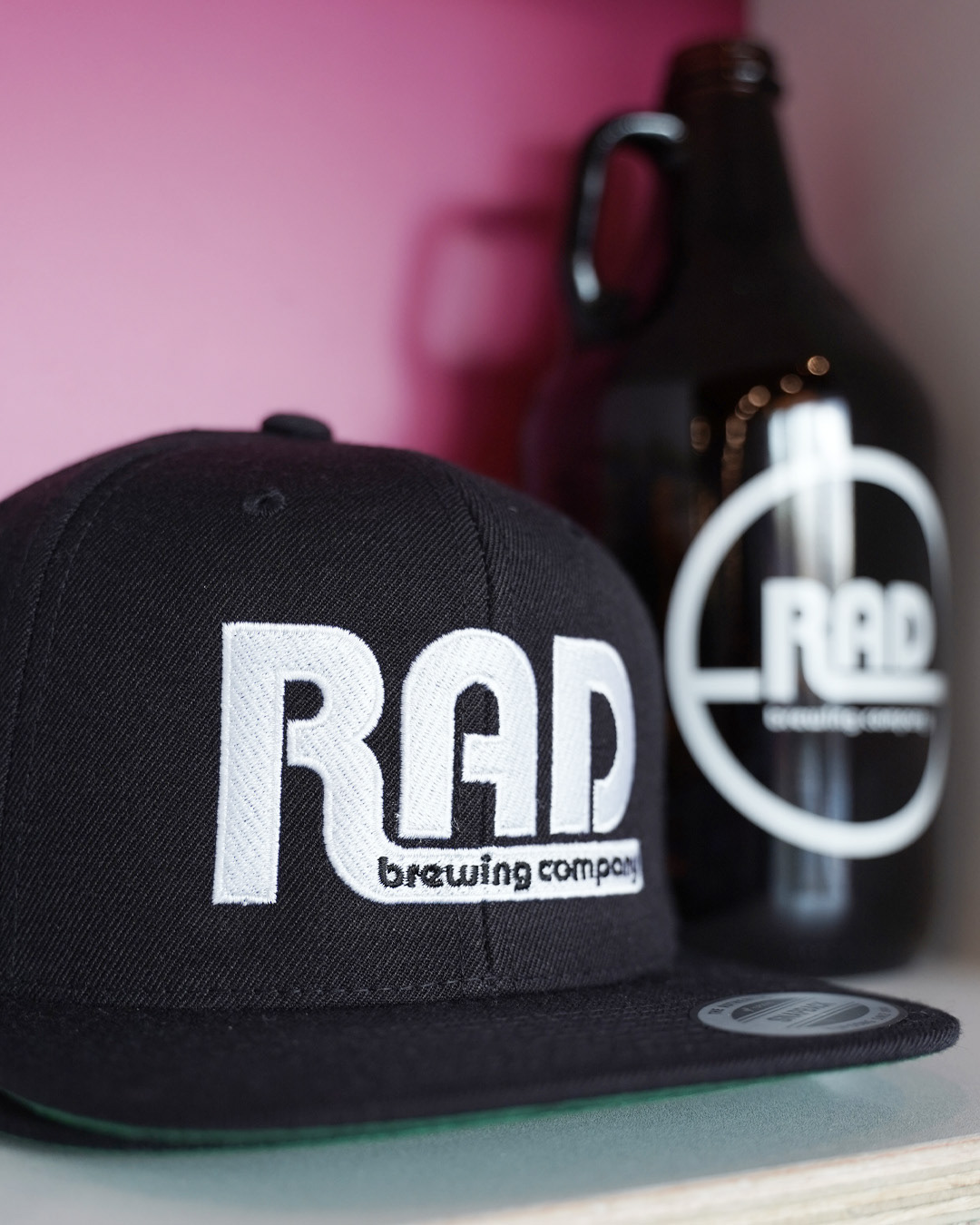
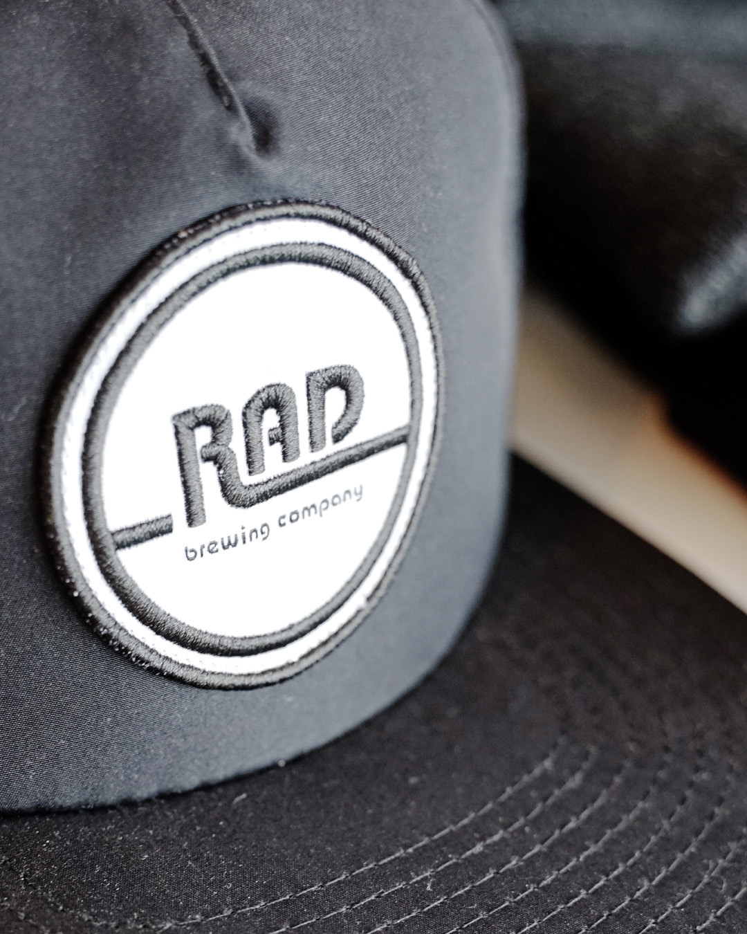
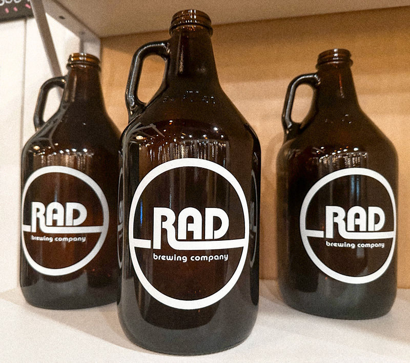
THE RESULT: WEBSITE
ALSO CHECKOUT...
The Solution: Logo & Branding
The branding solution for RAD Brewing Company drew inspiration from 1970s California branding and the Bauhaus movement's 'less is more' philosophy. The logo, featuring geometric, rounded typography, is laid-back and friendly yet simple and clean. This design direction perfectly matched the clients' needs, embodying RAD Brewing's core values and subtly referencing beach culture. The cohesive brand identity is bold and playful while maintaining a relaxed, approachable feel, ensuring it resonates with the local community.
Logo Design
Branding - Typography & Colours
The Solution: Tall Can Design
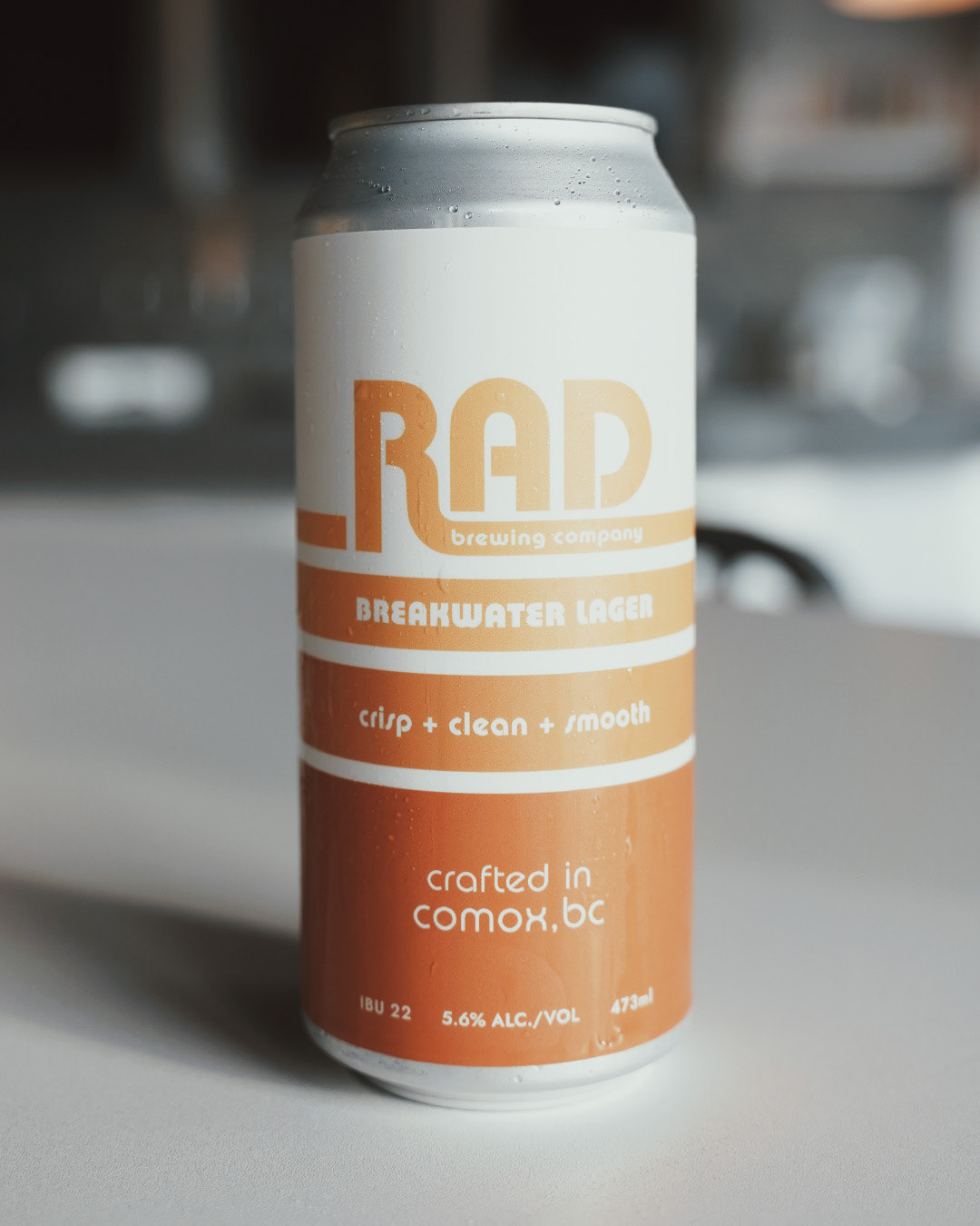
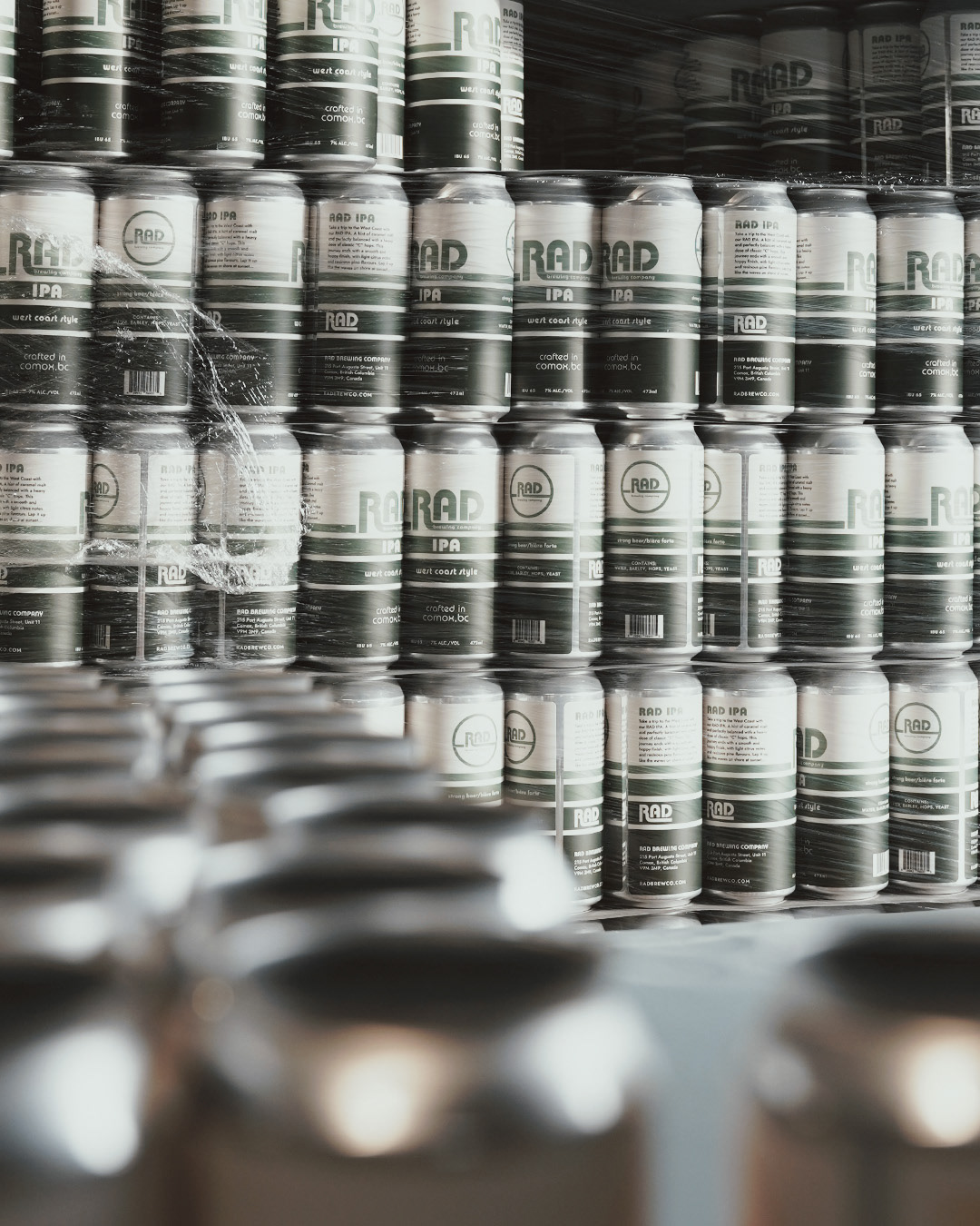
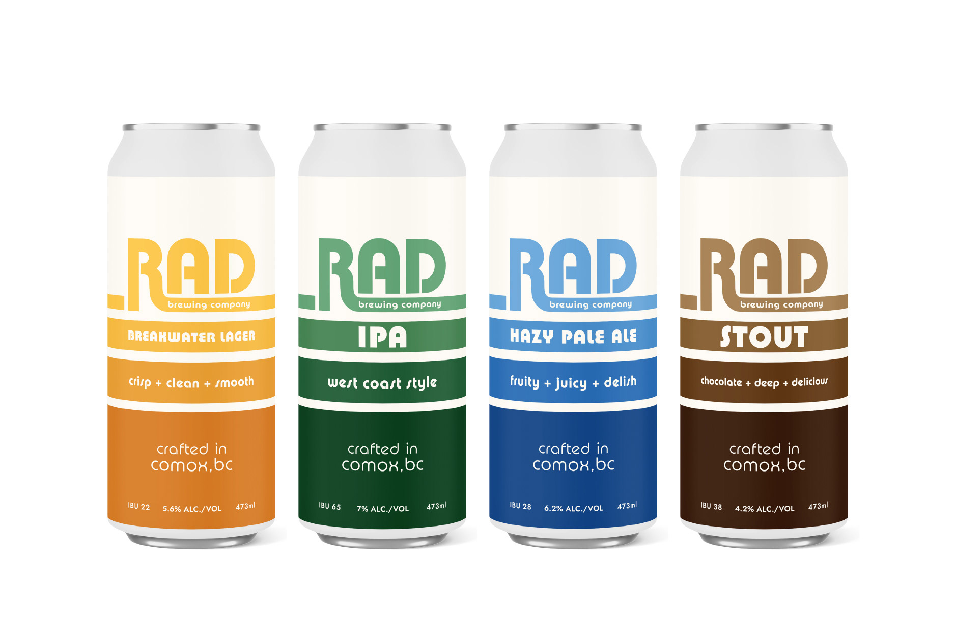
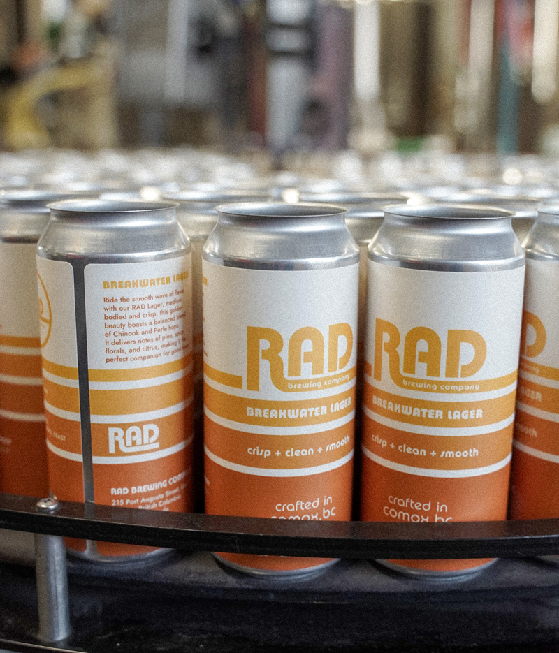
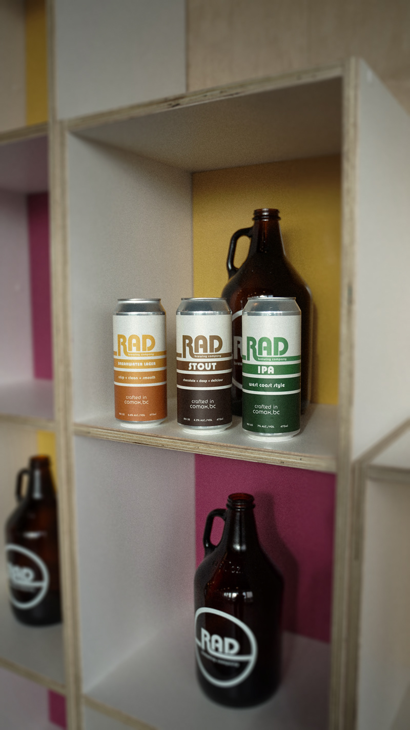
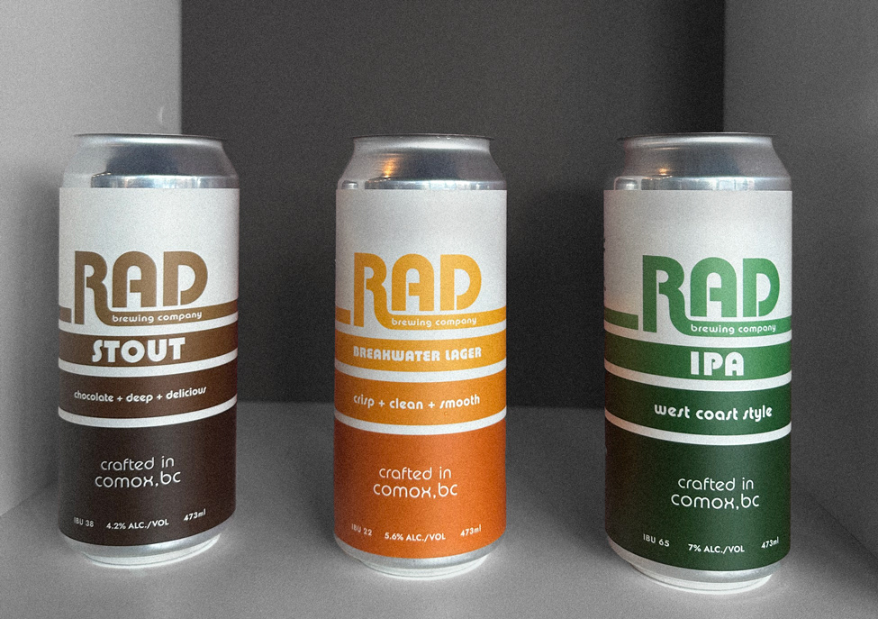
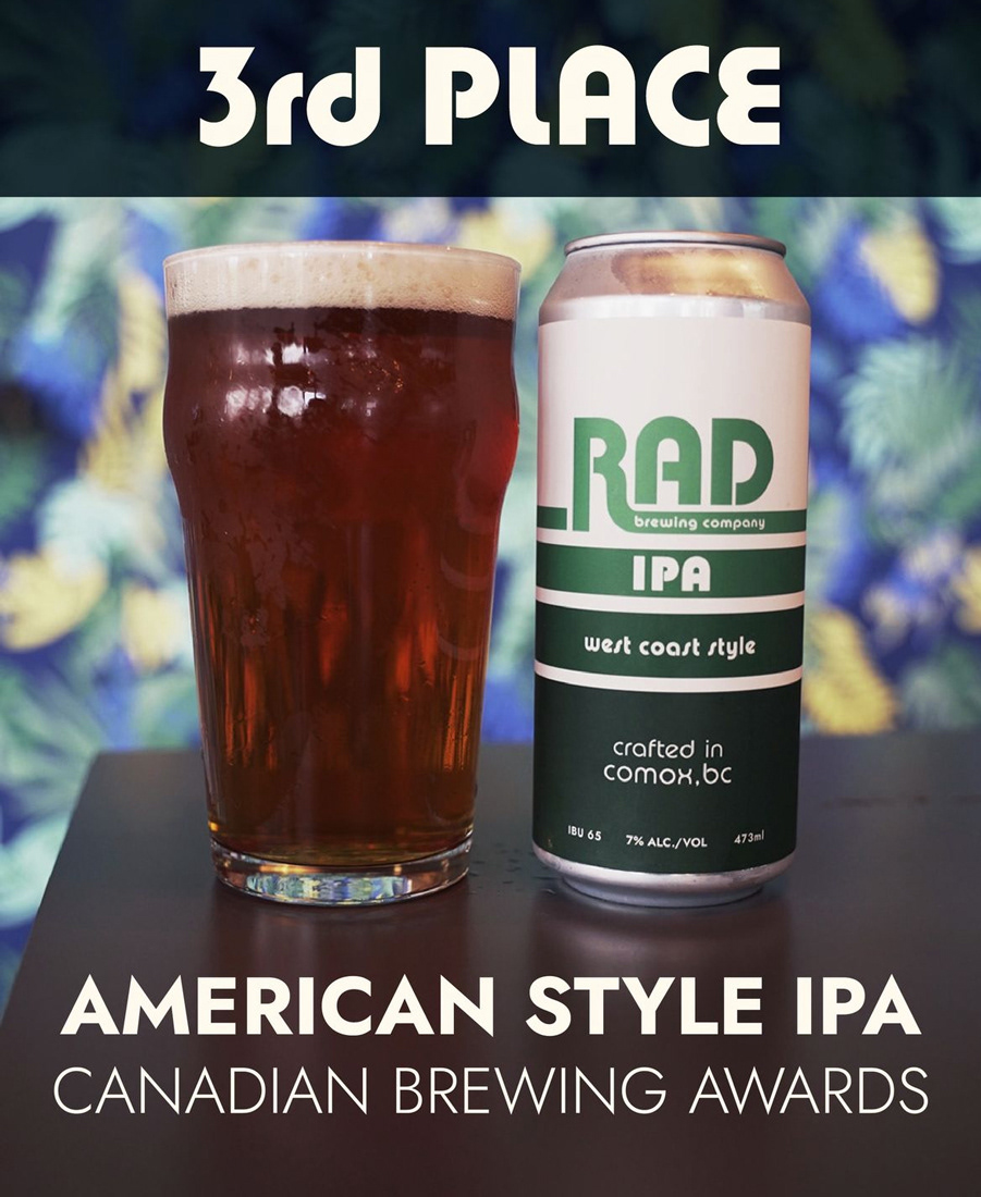
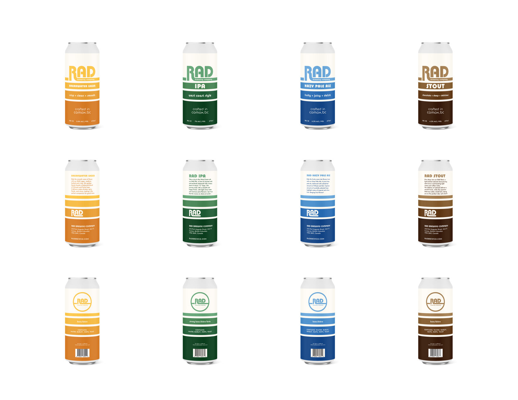
After creating branding & website that the brewery loved, I was asked to create tall can designs for their most popular beers: RAD IPA, RAD Stout, and RAD Breakwater Lager.
To start, I observed the craft beer section to see what stood out. While some cans had intricate artwork, they often didn’t convey much about the beer and were too complex to hold attention. The most effective labels were simple, eye-catching, and helped beer drinkers identify flavors or characteristics.
I aimed to create a can design that would be instantly recognizable, even if seen across the street. Using the RAD logo, I developed a 'retrowave' inspired graphic, reminiscent of waves at the beach. These simple lines organically integrate with the logo, drawing the viewer’s eyes toward it. The design employs simple shapes and lines to stand out without being overwhelming, maintaining cohesion with the brand’s beachy aesthetic.
Each can features the same shapes but in different, complementary colours to distinguish each flavor. This approach allows for product differentiation while using cohesive lines and shapes to stand out through emphasis, unity, and repetition. The lines hold text for key information, using hierarchy to guide the viewer’s eyes through the essential details with ease.
After the success of the first beers, we introduced a Hazy Pale Ale to the line-up.
The Solution: Aloha Amigo Can Design
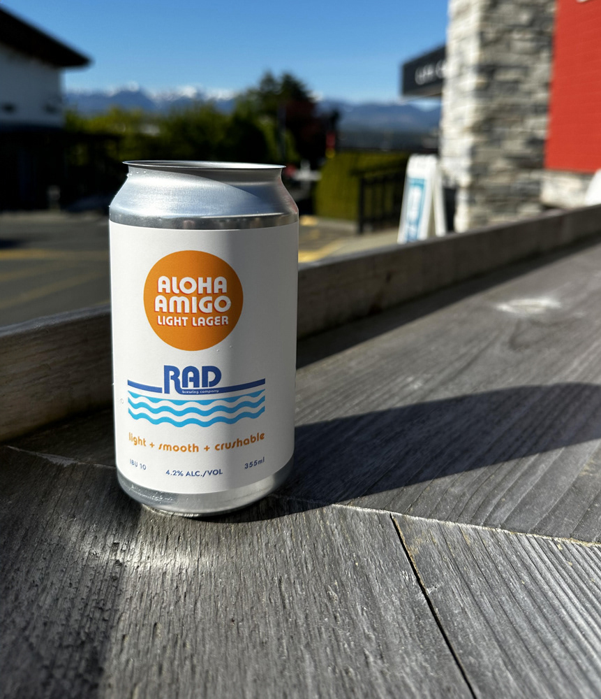
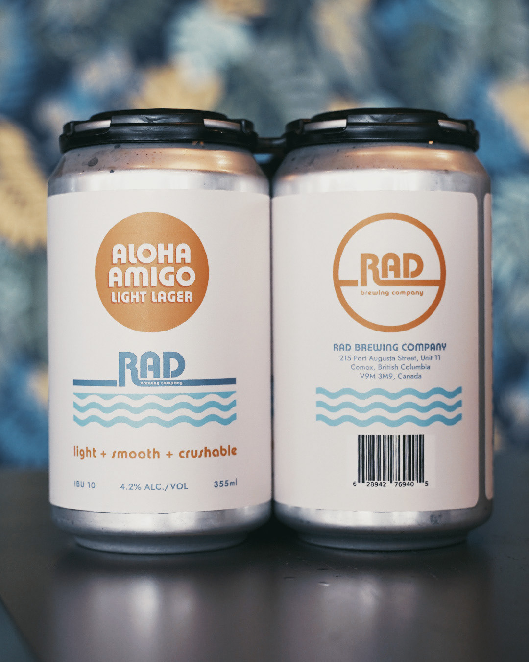
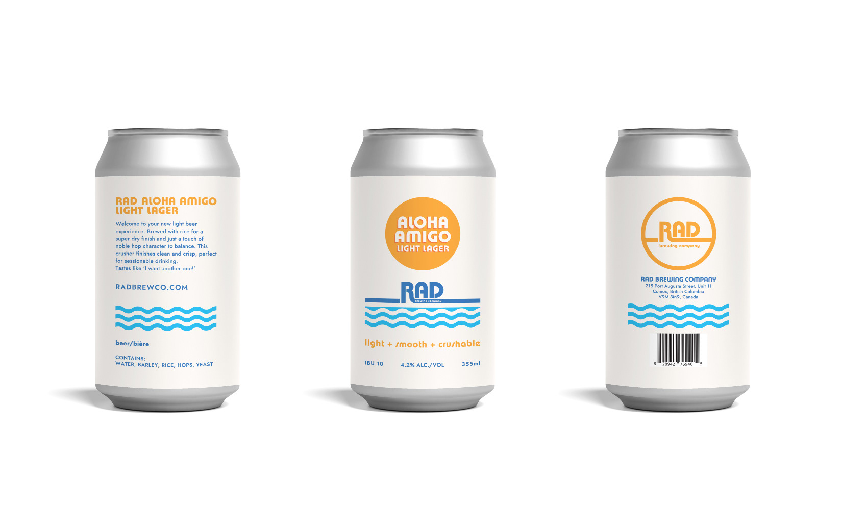
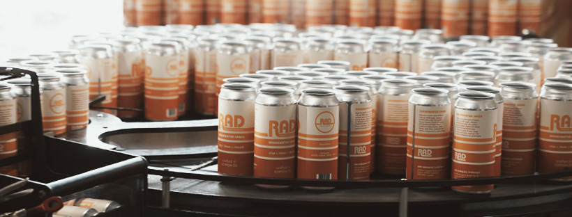
Following the success of their tall cans, RAD Brewing Company was ready to release a summer beer lineup called Aloha Amigo. They wanted a design that was cohesive with the existing tall can designs but on a short can with a more summery, tropical, and beachy feel. I took the line element from the first can and created a wave sunset, using a circle to represent the sun and feature the beer name in a fun font. This new design felt fresh while maintaining familiarity with the existing branding.
